


ART RECAP: Some Really Good Art, Doodles and the Colour Blue
We're looking back at the month of May and the art I made! Lots of good stuff, and also I reference both Hannah Montana and Devil Wears Prada in this post so I'd call that a big success.

Okay friends, it’s time for another art recap! Let’s look back at the month of May, and the art I made that month! I’m gonna toot my own horn for a second and say that I made some REALLY GOOD ART in May! It was just a really good month!! Very exciting.
I played around with colour a lot! And texture! And just everything fun you can do with digital art! Isn’t that wonderful?
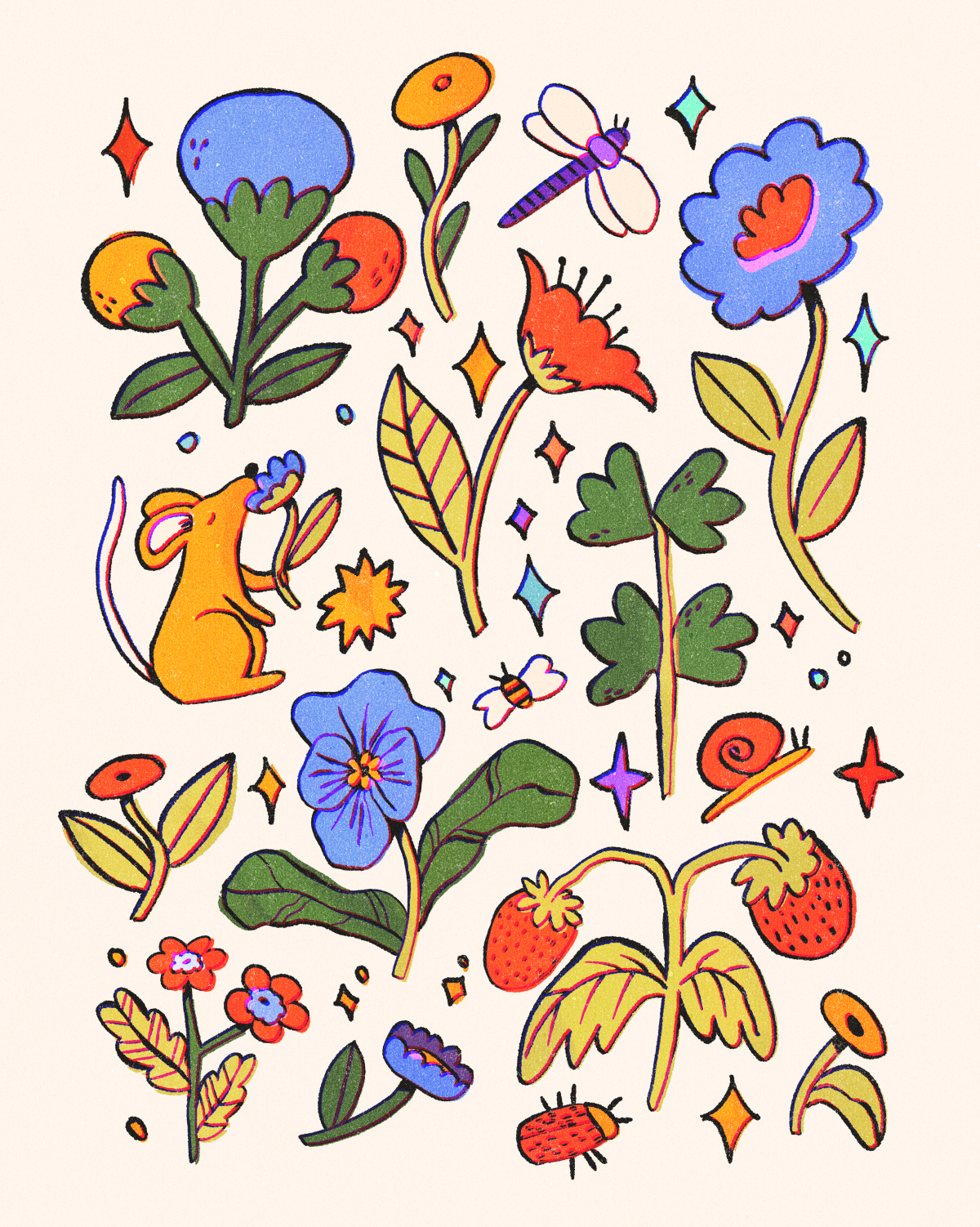
This month consisted of an intense amount of doodly little pages and collections of smaller drawings. I love drawing like this, it feels carefree and fun! And I love how this turned out! This month I started using blue, which is UNCOMMON for me, and it feels so refreshing and nice. Who would have thought! “My” colours tend to be warm, comforting and mostly green, red, orange and yellow, but this addition of blue, together with the bright reds and the light yellowy green stems of the flowers gives this piece such vibrancy. And I love vibrancy!
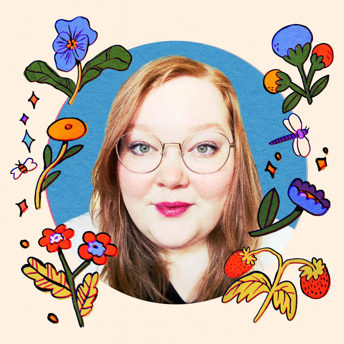
Next up is a new profile picture! I make new profile pictures every now and then, and usually incorporate a lil selfie to make it clear who’s behind all the art! FOr this one I mostly reused elements from the last drawing, but all for good reason. This was actually the fourth or fifth iteration of profile picture I made that day. I was indecisive, and spent ages on a piece I ended up not liking, as well as one with a square frame around it which I really liked until I realised the profile picture would probably be cropped to a circle. BUT in the end I ended up really liking this one! It feels bright and fun, and I got to show off my new glasses. (I am actually the most happy with my new glasses, tbh.)

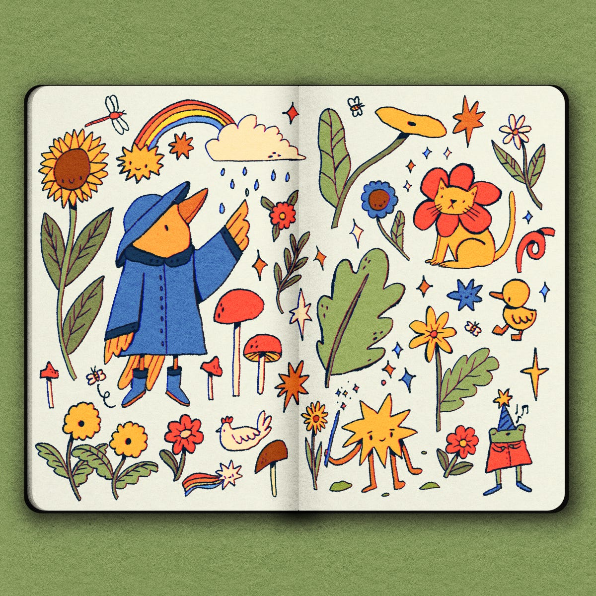
Something I’ve done for a few years is faking a sketchbook digitally. I almost never draw traditionally (and when I do I always do a two finger tap when I make a mistake to try to undo) but I still really like the visual of a sketchbook. Might seem kinda silly to fake it like this, but I always find that this sketchbook background ends up helping me keep a more relaxed approach to drawing - much like how I’d wanna use a physical sketchbook. Highly recommend! Also I don’t have any tattoos but I kinda want one of that little star guy wizard. So cute.
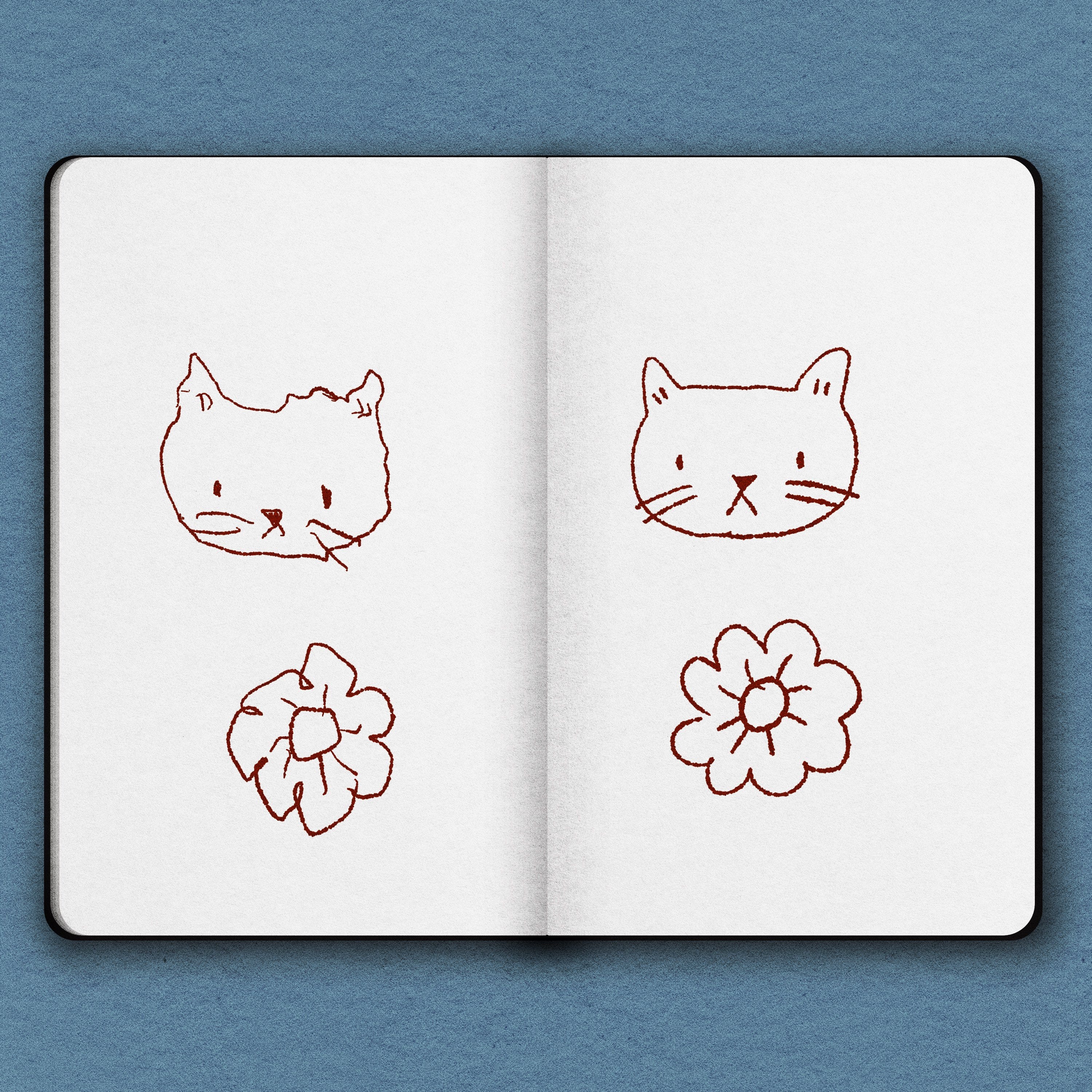
I challenged myself (and some friends) to draw a cat both with their dominant and non-dominant hand. Kinda hard to guess which one is my non-dominant hand, tbh. I’m probably very talented and extremely ambidextrous.
Actually I kinda like the left cat. It looks wonky and cute (something I aspire for my art to be!).
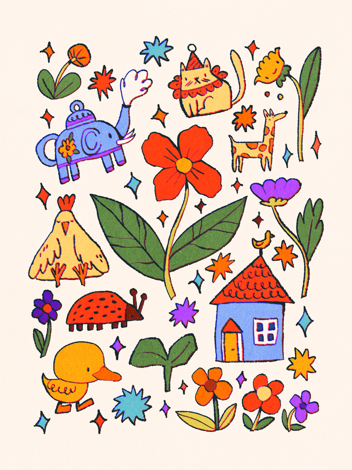
HECK! I had so much fun with this one, it’s ridiculous. And I think it shows? Art is a weird thing, but I feel like it often shows if the person who made it actually had fun. To quickly sum up my feelings about this one: I want that elephant teapot, and the house gives me Moominvalley vibes. 10/10.
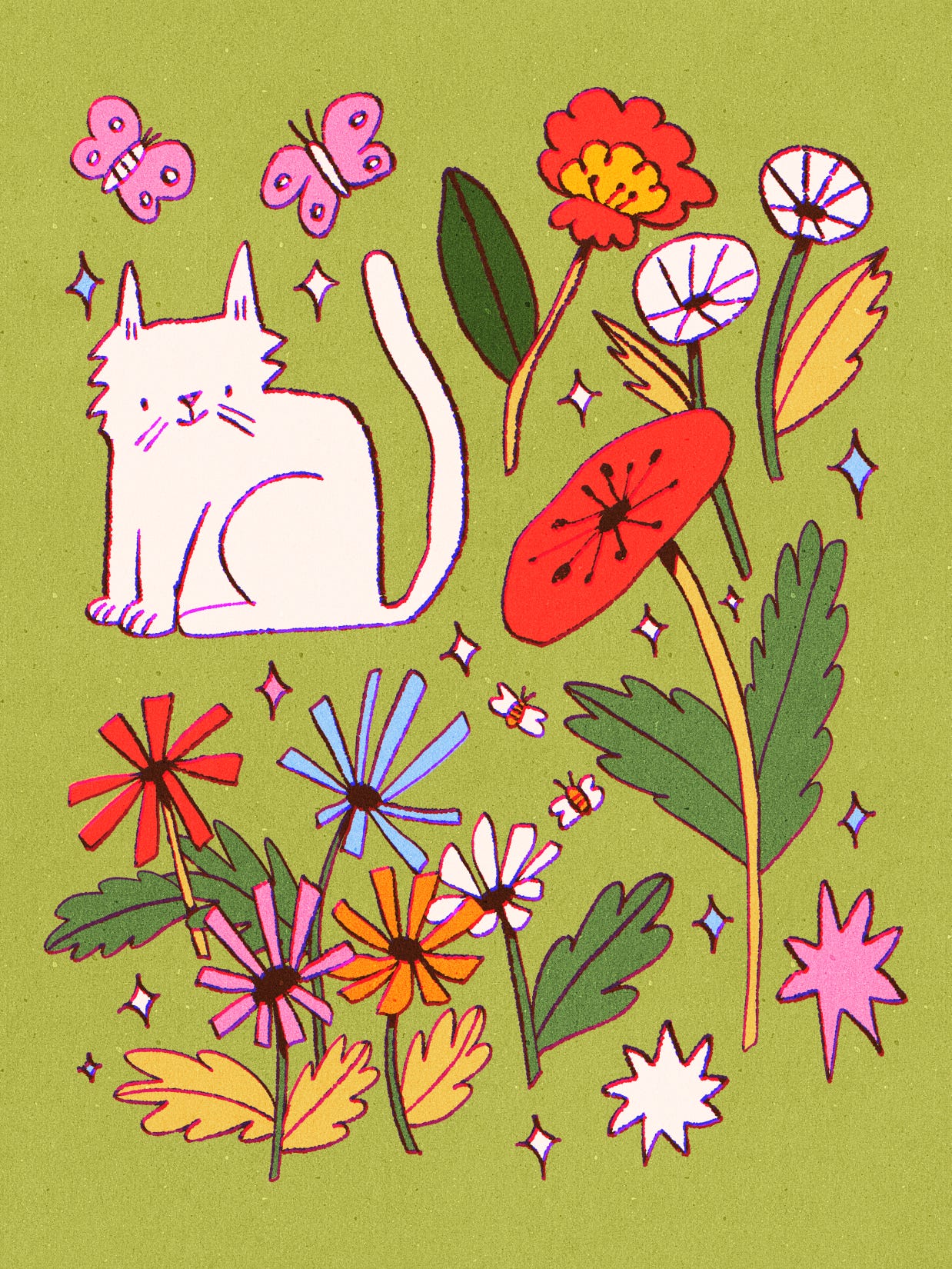
I started exploring more about “deconstructed scenes”. Like a fancy chef, I wanted to take the parts that make a scene and just place them next to each other rather than in the actual scene, seeing if I could still give the feel of a scene. Here’s a lil garden cat. Very cute. 12 bees out of 10 possible.
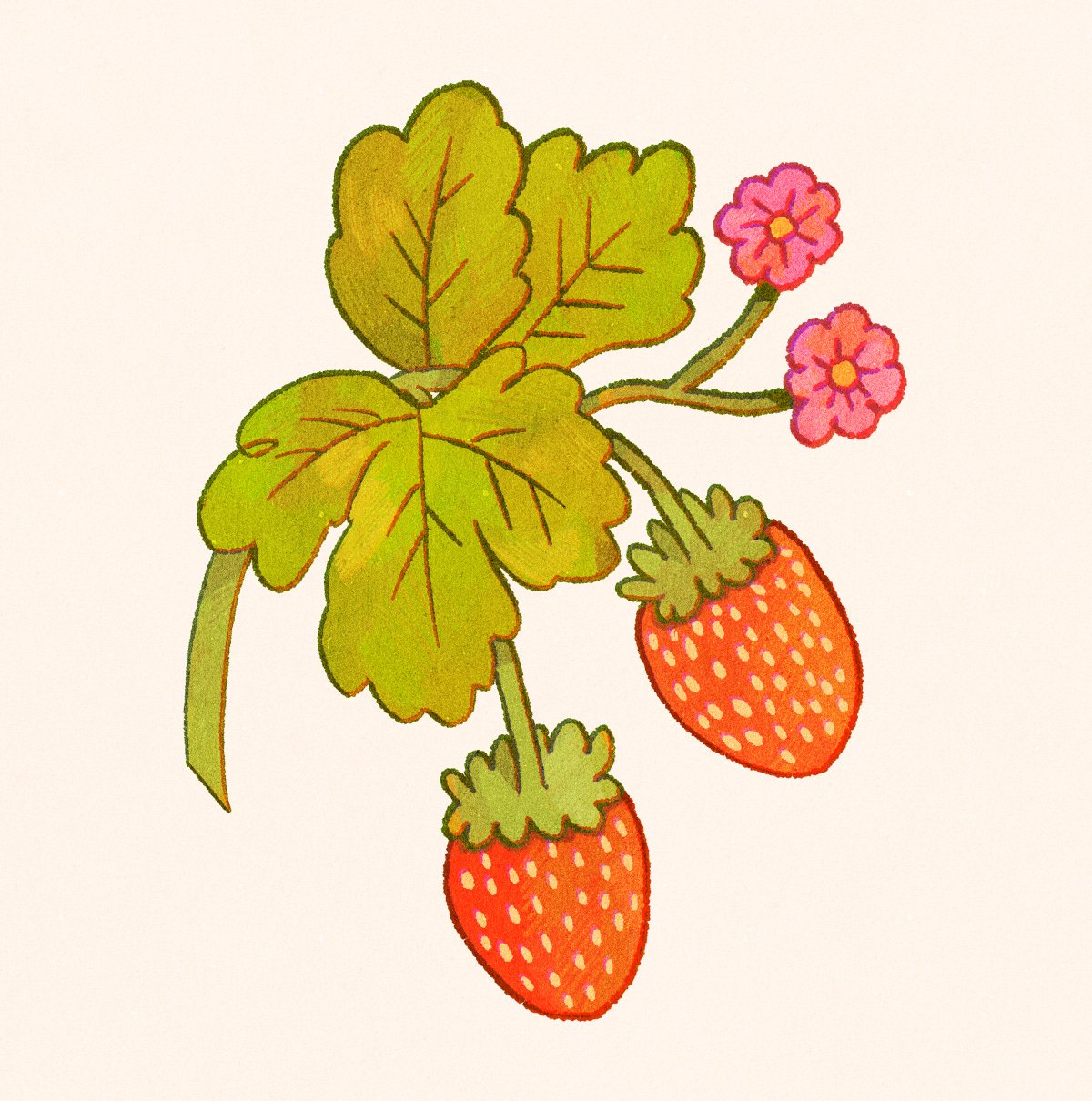
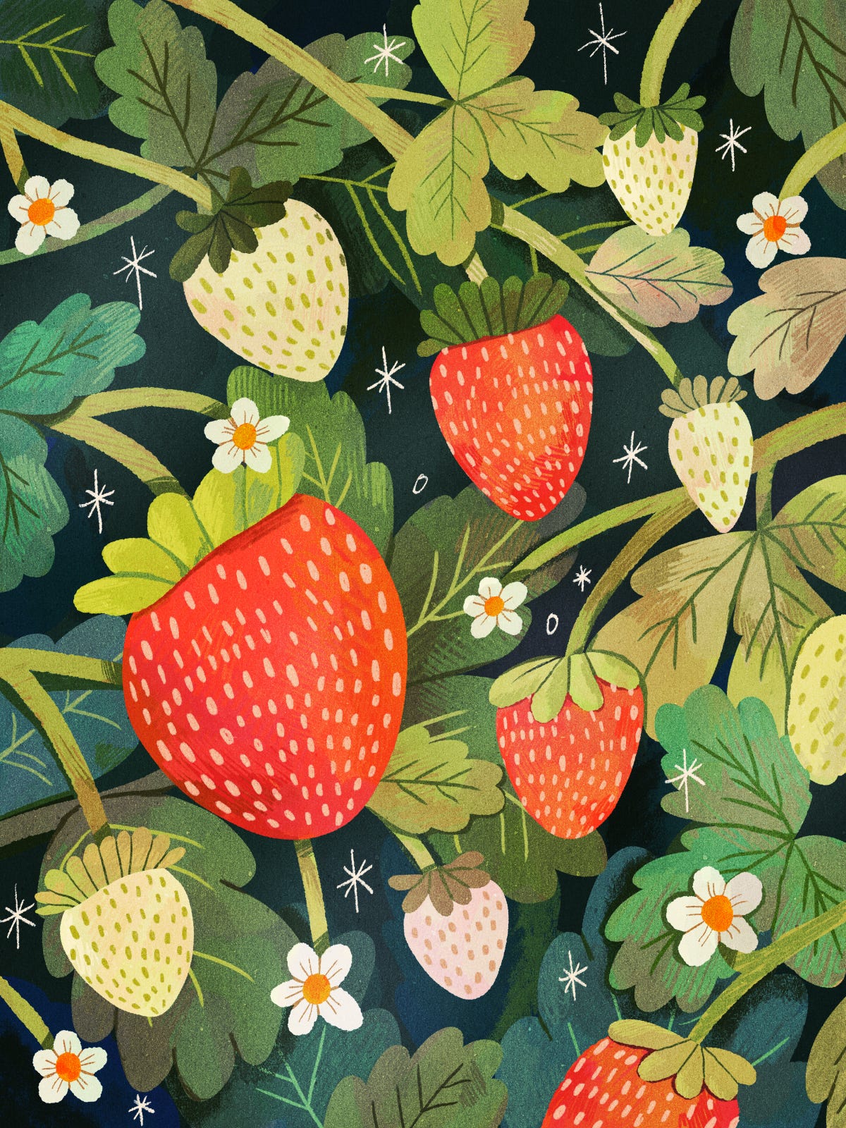
Strawberries? In May? Groundbreaking.
Devil Wears Prada quotes aside, I don’t really think art ideas have to be groundbreaking to be worthwhile. And also I bloody love drawing strawberries. They’re just so fun! And I love giving them fluffy little “hats” like this.
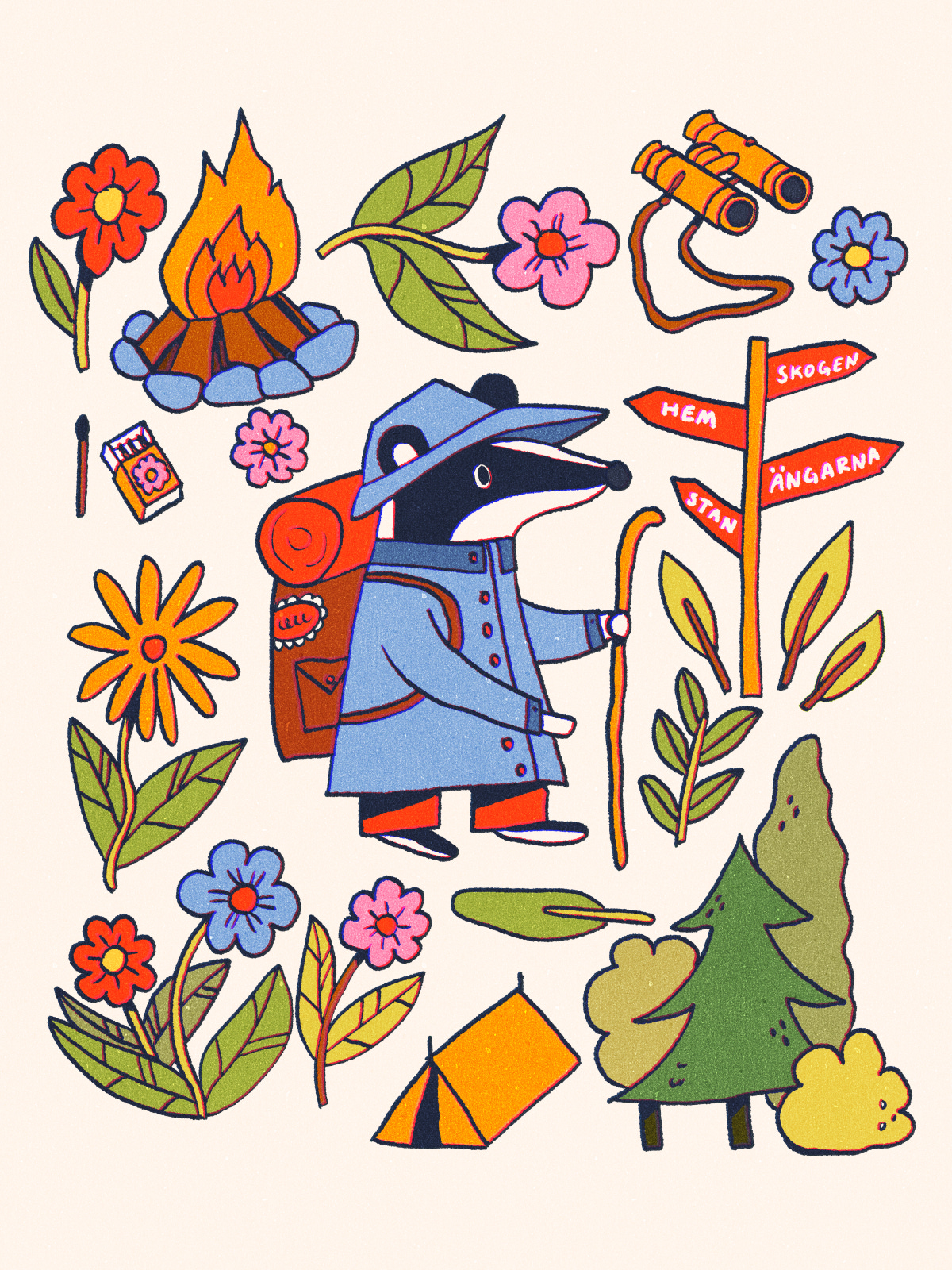
One of my favourite pieces of May (and maybe ever) was made inspired by a prompt for the Instagram art challenge “Bon Voyage Week”. The prompt was “solo trip”, and I decided to bring back my old character Badger and let him go camping again.

This is what I mean with May being a good month. These two pieces BACK TO BACK? I’m so proud! I absolutely LOVE this one! I struggled a lot with the colours but ended up experimenting with the Gradient Map tool in Procreate and got this and went from “why am I even trying” to “hmmm I am brilliant actually” in like 10 seconds. Gradient Maps are great for trying out new palettes, honestly.
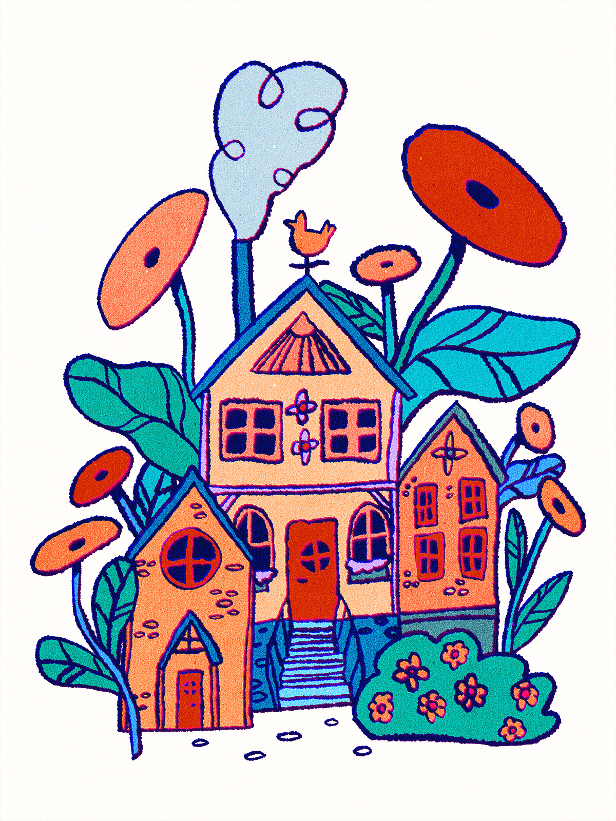
Silly colours for silly houses, yes. Just being my whimsical self!

Okay… I actually feel like I ended the month on a low. Well not a low exactly, but these colours are NOT IT. The flowers are cute, but these colours feels like needles in my eyes. But in the wise words of Hannah Montana “everybody makes mistakes”.
Anyway. That was a good month!! Some really good pieces, and some fun new colours. OH ALSO I made a new outline brush that I absolutely love (used in these last three pieces) because it’s just sooo textured but still opaque so it works well with the fill tool! Exciting!!
Do you have a favourite out of these pieces? And if you are an artist, how was the month for you? Let me know!!
Many hugs!!
Jessica
Ahh, I just love seeing your pieces all together like this, they are so joyful! You're so right too, art doesn't have to be all that complex for it to be 'good art'. We're taught that 'art should make us feel things' and joy IS a feeling! 🤩